Solar Thermal Monitoring Program Makes Progress
I thought I would give you a preview of the solar thermal monitoring program I’ve been working on lately.
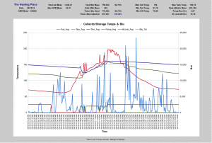
 To the right is a screen shot of one day’s data from a drug rehab center in Raleigh. (Click for larger image.) The system has 1500 ft2 of collector area and a 2000 gallon storage tank.
The graph shows the collector temp (red = Tcol), the bottom of the tank temp (green = Tsto), and the top of the tank (blue = Tlim).
The light blue line indicates the Btu delivered to the DHW per 5 min period.
Along the bottom of the graph are the pump on/off (green = pump) and the collector high limit on/off ( red = HiLimit). The typed data at the top is condensed from the raw data into averages and totals.
We have the DHW Btu meter on the domestic hot water load, but we don’t have one on the collector loop, so I calculate the “theoretical” energy generated in the collecctor loop using the standard collector flow rate (.025 gpm/ft2) and the dT = (Tcol-Tsto).
The DHW Btu meter senses the cold water inlet temperature and the exchanger outlet temp. When sitting still, the cold water sensor will warm up some due to convection of heat from the tank. So, I like to calculate the theoretical DHW Btu using the lowest CW temp reading for the day.
Using the measured and theoretical energies above, we can compare the (theoretical) solar energy input to the actual energy output into the DHW. On a good solar day, we collect more than we use. On a bad solar day we use more than we collect. Likewise, we can compare the theoretical DHW Btu used with the measured Btu. This lets us see how important the effect of the DHW cold sensor is as it heats up and down. The difference is actually smaller than expected, about 3%. We found out that if we move the cold water sensor 2 feet back horizontally on the incoming pipe, the temperature is much more stable.
As you can see, we are having fun doing “research” on the operational characteristics of the system. This will help us learn more about controls and energy predictions on future systems. Watching the collector temperature curve on clear and cloudy/rainy days, coupled with the collector pump run time can be entertaining all by itself.
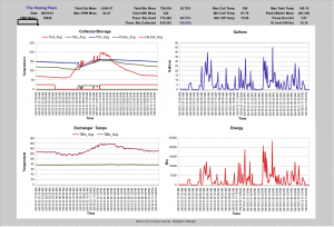
 The second screen shot is four graphs showing all the data sets and the calculated values.
These graphs come from a spread sheet of the data.
When we get the database program finished, we can be much more flexible about data display in our solar thermal monitoring.
We plan to roll out this system for commercial use, so we are interested in your views on what you would like to see on a graph. Please be sure to leave your comments and questions below!
Dr. Ben
